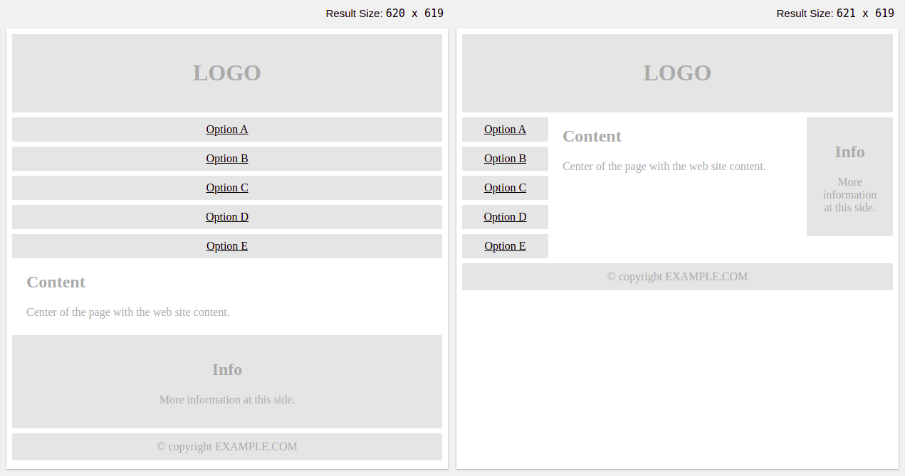
BASIC PAGE LAYOUT 1
<!DOCTYPE html>
<html>
<head>
<meta name="viewport" content="width=device-width, initial-scale=1.0">
<style>
* {
box-sizing: border-box;
}
.menu {
float:left;
width:20%;
text-align:center;
}
.menu a {
background-color:#e5e5e5;
padding:8px;
margin-top:7px;
display:block;
width:100%;
color:black;
}
.main {
float:left;
width:60%;
padding:0 20px;
}
.right {
background-color:#e5e5e5;
float:left;
width:20%;
padding:15px;
margin-top:7px;
text-align:center;
}

@media only screen and (max-width:620px) {
/* For mobile phones: */
.menu, .main, .right {
width:100%;
}
}
</style>
</head>
<body style="font-family:Verdana;color:#aaaaaa;">

<div style="background-color:#e5e5e5;padding:15px;text-align:center;">
<h1>LOGO</h1>
</div>

<div style="overflow:auto">
<div class="menu">
<a href="#">Option A</a>
<a href="#">Option B</a>
<a href="#">Option C</a>
<a href="#">Option D</a>
<a href="#">Option E</a>
</div>

<div class="main">
<h2>Content</h2>
<p>Center of the page with the web site content.</p>
</div>

<div class="right">
<h2>Info</h2>
<p>More information at this side.</p>
</div>
</div>

<div style="background-color:#e5e5e5;text-align:center;padding:10px;margin-top:7px;">© copyright EXAMPLE.COM</div>

</body>
</html>
BASIC PAGE LAYOUT 2
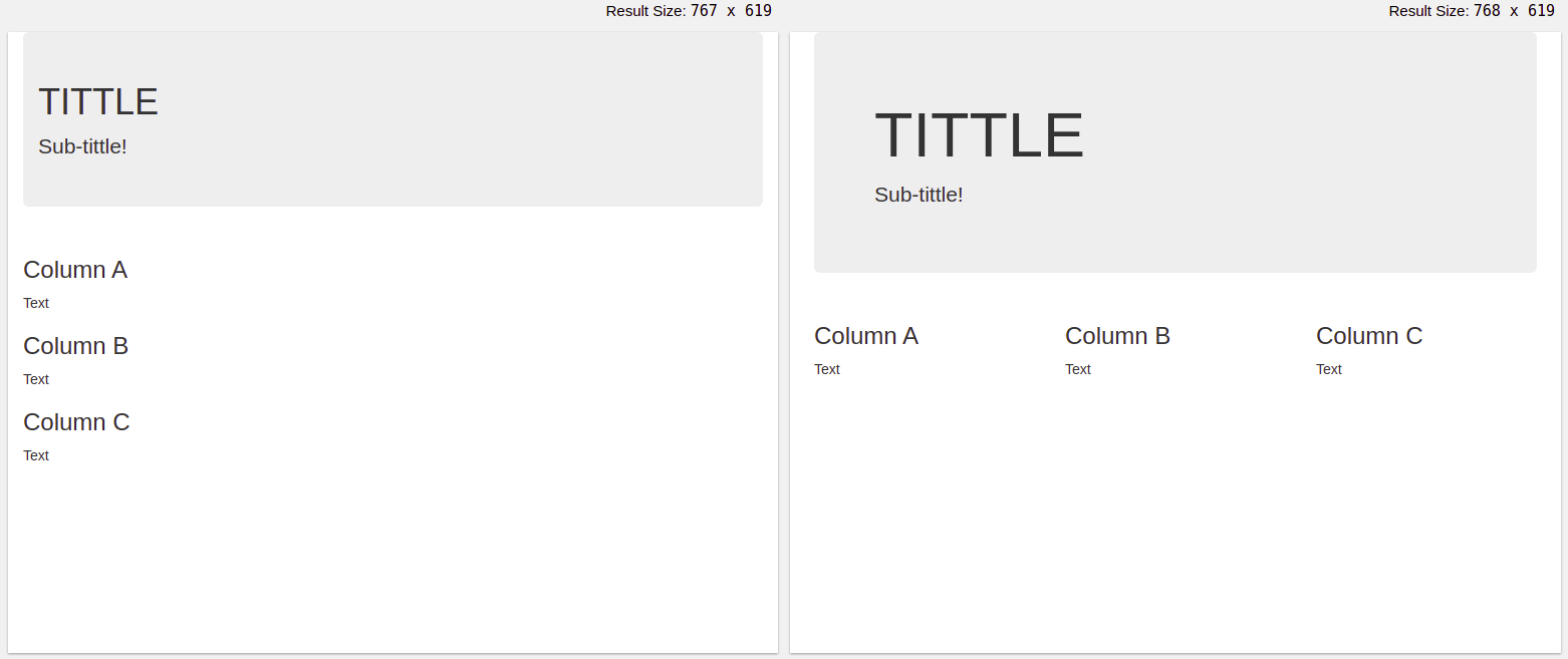
<!DOCTYPE html>
<html lang="en">
<head>
<title>TITLE</title>
<meta charset="utf-8">
<meta name="viewport" content="width=device-width, initial-scale=1">
<link rel="stylesheet" href="https://maxcdn.bootstrapcdn.com/bootstrap/3.4.1/css/bootstrap.min.css">
</head>
<body>

<div class="container">
<div class="jumbotron">
<h1>Title</h1>
<p>Sub-title!</p>
</div>
<div class="row">
<div class="col-sm-4">
<h3>Column A</h3>
<p>Text</p>
</div>
<div class="col-sm-4">
<h3>Column B</h3>
<p>Text</p>
</div>
<div class="col-sm-4">
<h3>Column C</h3>
<p>Text</p>
</div>
</div>
</div>

</body>
</html>
VIEWPORT META
<meta name="viewport" content="width=device-width, initial-scale=1.0">
IMAGES
<img src="img_girl.jpg" style="max-width:100%;height:auto;">
SEE ALSO
CSS Cheat Sheet [Link]
JS Cheat Sheet [Link]
2 Replies to “Responsive Web Design Tips”
Comments are closed.